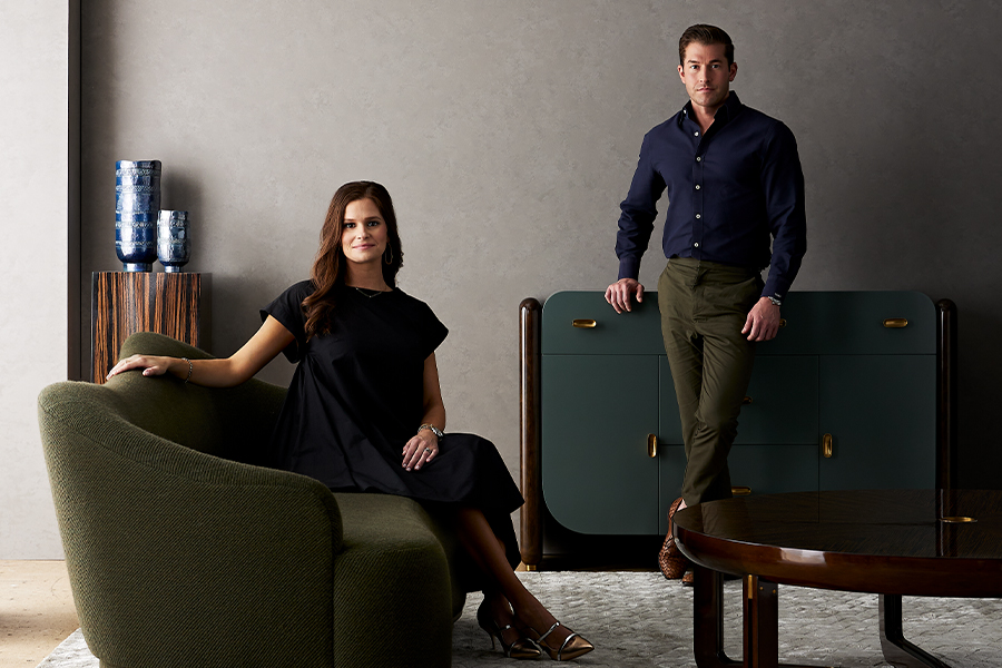
For the past 16 years, Leigh Nelson has led the creative vision of her New York-based graphic design firm, LMNOP, where her layered, narrative-driven, and often playful aesthetic infuses projects with a fresh energy.
The firm’s name—which includes Nelson’s initials and is also a riff on the “most memorable part of the alphabet,” she says—is a calling card in itself. “It’s kind of a litmus test if you’re a right- or left-brained person,” Nelson points out. “If people are creative, they love it—they get it.”
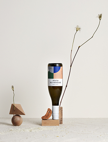
Bright colors and graphic patterns define Brooklyn Kura’s sake labels
Growing up in Maryland, Nelson was always drawing or painting, so much so that she studied studio art in college at Virginia Tech, minoring in graphic design. After graduating, she moved to New York, where she landed in the publishing world, helping to craft the design narratives for magazines like Marie Claire and Travel + Leisure. “I loved it,” she says. “It was a fun space to be in when you’re a young designer, but I felt like I wanted to be more hands-on with things.”
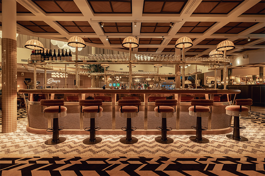
Enter LMNOP. One of her first clients was the Smith restaurant in New York, which opened the door to a longterm collaboration with Morgans Hotel Group. But it was her firm’s work on Tonchin, a Japanese ramen brand that was making its debut in the U.S., that proved pivotal. Tasked with adapting the heritage brand for a new audience, Nelson introduced bold, geometric graphics and patterns that form endless combinations on menus, handmade ramen bowls, and the scarves worn by servers.
The initial trepidation in those early meetings gave way to excitement for the new direction. “They trusted us, and we have since expanded the brand into new locations,” she says. That project caught the attention of a creative director at Nike, who tapped LMNOP to design an 11-piece line for the Tokyo Marathon, inspired by her work on Tonchin.
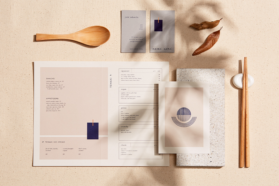
For New York eatery Nami Nora, LMNOP took cues from Japanese craftsmanship
Whether crafting sake labels for the Brooklyn Kura taproom or the visual identity for skincare brand Lula, Nelson’s style is ever-evolving. “That’s the beauty of my job,” she says. “I don’t ever want to seem one note. I flip-flop so much. One day, I’m a maximalist adding all the colors and layers, and the next, I want to pare it back and see what bespoke minimalism feels like.”
Her nimble team of three people—kept small to stay creatively agile—begins each project by laying the strategic groundwork to ensure the brand is rooted in a sense of place. From there, Nelson weaves a strong narrative, building what she calls “a living, breathing visual system.”
Take Postcard in New York. The petite bakery drew inspiration from Japan’s Taisho Roman era, taking cues from vintage postcards, Art Deco typography, and historical wallpaper patterns to create a “fun project where there were so many layers and stories,” she says of the playful yet cohesive design.
With Blue Flag Capital’s Faraway Hotels in Nantucket and Martha’s Vineyard, both in Massachusetts, she had the rare chance to craft the brand from the ground up, with each property anchored by its own muse. “It has been creatively fun because as the brand grows, we can reinvent it each time,” she says. In Martha’s Vineyard, for instance, that translated to a visual language that blends the island’s natural beauty with the free-spirited style of the 1960s and ’70s.
“I love hospitality to its core,” Nelson adds. “I love the experience of it all; every little detail to me is thrilling.”
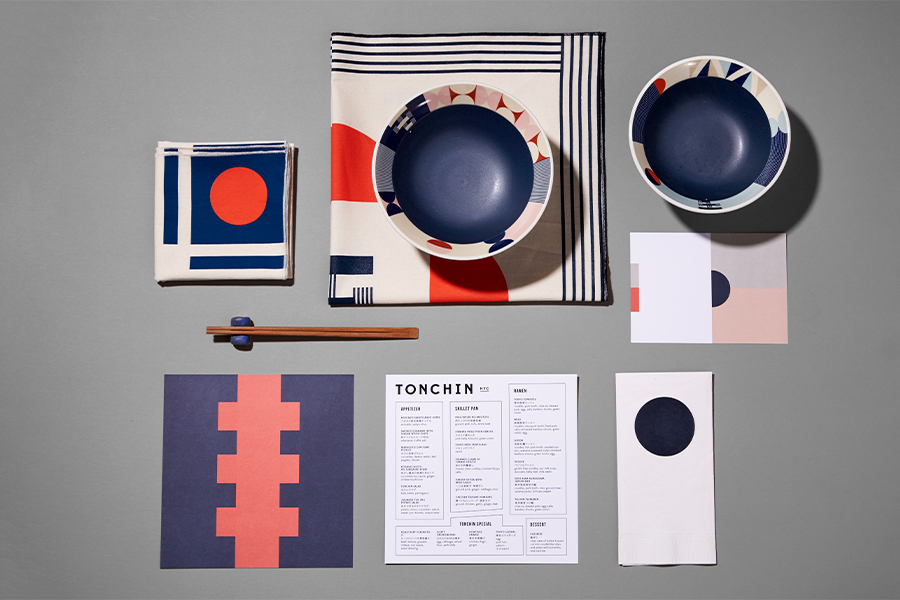
Geometric shapes freshened up Tonchin’s identity for its U.S. debut
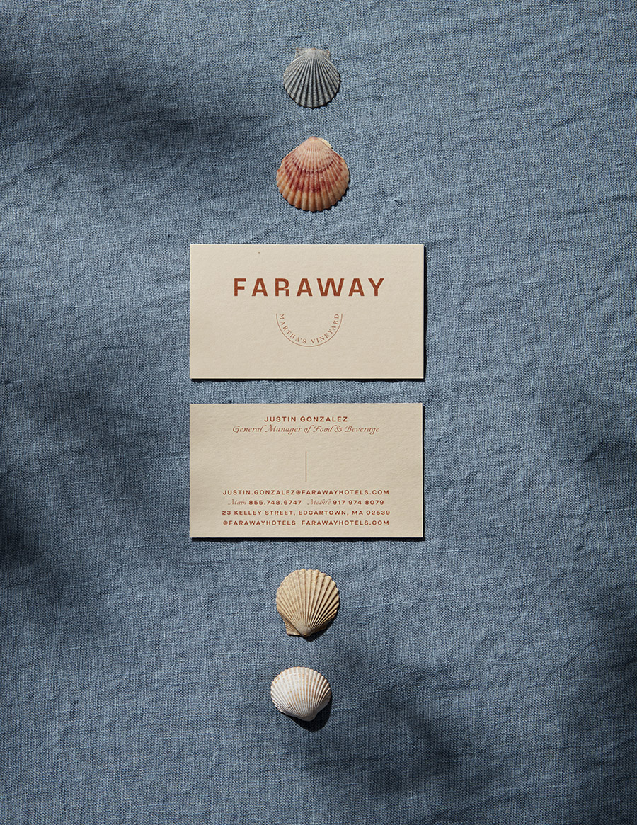
The colors of Faraway Martha’s Vineyard nod to the landscape
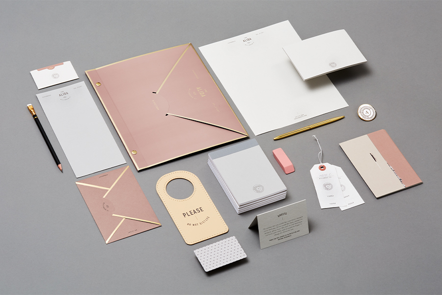
The branding for the Alida hotel in Savannah, Georgia pays tribute to its southern roots
This article originally appeared in HD’s September 2025 issue.