Paula Scher
EPISODE #67

Summary
Paula Scher’s career is as wide ranging as it is inspirational. The former art student, who pivoted to graphic design, is also a children’s book author; she’s designed album covers for artists like John Prine; she launched her own magazine, Together, with Terry Koppel; and she became the first female partner at New York-based multidisciplinary firm Pentagram, where she’s worked for the last three decades. Among her many clients, her indelible work has transformed the Public Theater in New York, where she learned many lessons over the course of the almost 30 year relationship. Though she has sometimes felt like a misfit, she sees that as another way of rebelling against the belief of what she’s supposed to be. From the beginning, she says, “I have tried to defy expectations.”
VIEW TRANSCRIPT
Stacy Shoemaker Rauen: Hi, I’m here with Paula. Paula, thanks so much for joining me today.
Paula Scher: Glad to be here.
SSR: So, we always start at the beginning. Where did you grow up and did you always have a love of design or were you creative minded growing up?
PS: I was. I liked to draw. I was born in Washington DC. My father worked for the government. I lived until I was 7 in Falls Church, Virginia, and then we moved to Silver Spring, Maryland. But it’s all around the Washington DC area. I drew so much that when I was about 12 years old, my parents sent me to the Corporate School of Art in Washington to take drawing and painting classes on weekends. I did that all through high school, which was very bizarre. High school students didn’t do that. But I really liked the environment, and I think it was the first place I really felt comfortable.
SSR: I’ve read a previous interview where you said you were terrible at everything in art school.
PS: Oh, yeah.
SSR: Tell us about that.
PS: Well, in high school, it was unusual being good at art. I was the publicity chairman of the school and there was a high school teacher named Mr. Tucker, who had a little box outside the art room with a glass cover, and he had something called Picture of the Week. I used to work really hard to get Picture of the Week and I had them a lot. I think I had them the most of anybody one year, and I was the school artist. Then when I went to art school, everybody was the school artist, and of the school artists, I was really low down on the list. They were better than me. They had better drawing skills. People were better painters. I was terrible in crafts and sculpture. I was sloppy. I didn’t know how to control anything.
As a matter of fact, in my first two years of school where you took every sort of discipline you had to, I really felt like I was terrible until I got into something called graphic design, and graphic design, I thought it was going to be like the basic. You moved a black square around a white page and you had to glue it down with rubber cement, and my rubber cement always oozed out of the sides and was rather disgusting. So, in my sophomore year when I took graphic design, it wasn’t about that at all. It was about ideas, and you made things like posters and you made book jackets and you expressed ideas for other topics, and I was good at it. So, I stayed with it. Do what you do best.
SSR: Yeah. Exactly. Were your parents creative? Or it’s just amazing that they pushed you to this art school.
PS: No, they didn’t push me to the art school. I pushed me to the art school. I fought and screamed and cried until I got my way.
SSR: Oh. There you go.
PS: It’s just the truth. I also went out and got a student defense loan, which they took to pay for it, which they then felt guilty and paid for it. I skipped over that part. Now, this is the thing I could do, and nobody thought I knew what I was doing. Least of all, me. But I knew what I was doing, and years later, I thought, well, how could I have not done that? But when I got to art school, the shock was I wasn’t the best in art. Sort of near the bottom, I’d say.
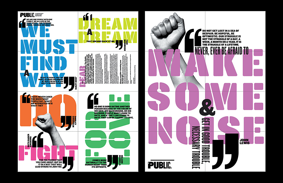
The posters for New York’s Public Theater
2020-2021 season use stencil typography
SSR: Well, look at you know. So, did you continue graphic design through college?
PS: Yes. I majored in it and I had an amazing teacher named Stanislaw Zagorski, for whom I owe so much. He found the parts of me that were really functioning and encouraged them. I thought I wanted to be an illustrator. As a matter of fact, my major in graphic design was really on the illustration side because I didn’t understand how to work with typography. In those days, there were computers and I worked with press type, which was the technology of the day, and you rubbed this thing down on the corners of book jackets. Invariably, my type did not line up and it was plastic and it cracked, and it flipped off the page and I was sloppy and I couldn’t control it, and I hated typography because I thought that’s what type was, was rubbing something down on the corner of a design.
My teacher, who had a very thick Polish accent, said, ‘Illustrate with type,’ and those three words made my entire career. It took me a couple of weeks to figure out what he meant. But when I figured it out, I knew it because I realized that typography had form and it could be expressive and that you could accompany it with words and it would imbue the words with a kind of meaning that you didn’t expect that would be memorable, and that’s what I do.
SSR: That’s amazing. What did you do right after school? What was your first foray into the field?
PS: Well, Mr. Zagorski, when I think of him, I don’t think of him as Stanislaw Zagorski, I think of him as Mr. Zagorski, made appointments for me in New York and I met art directors and I met my future husband that way, Seymour Chwast, who owned, he was partners with Milton Glaser and a business called Pushpin, and I met him with my portfolio in 1970. But Mr. Zagorski got on the phone and called up people and he drove me to New York in his Ferrari, which he had. He drove with one finger and at about 90 miles an hour, took us an hour to get to New York. I was terrified. I remember that. But he mentored me, and I owe him a great deal.
SSR: That’s amazing. So, you started to work for CBS Records then?
PS: No. I had a lot of different jobs. I was half illustrating. I wrote a children’s book, illustrated it, the children’s book was lost. Then another illustrator, I showed him the text for the children’s book, and he wanted to illustrate it, a man named Stan Mack. He took it to a publisher at Pantheon Books, and it was published when I was, I think, 23 years old.
SSR: That’s amazing. What was the book about?
PS: It’s still in print. It’s called The Brownstone. Random House had it for about 25 years, then it finally went out of print, and then Princeton, who is my current publisher, just republished it a couple of years ago. It still sells, it’s still on Amazon, it gets good reviews. It was written when I first moved to New York, so it was about this brownstone that a bunch of animals lived in, and the provocateur, the protagonist, I should say, is a bear. It’s a bear family that’s hibernating for the winter and a kangaroo moves in next door and they’re taking dancing lessons. So, it provokes this series of moves.
I had illustrated the book, really when I sold the idea that I never really wrote a text. I had a series of diagrams, which told you what the action was and how they had resolved their problems in this communal living situation. So, there were starving mice and feasting pigs and they lived next door to each other in the end, and there was an opera singing cat who got together with the kangaroos and formed a nightclub act. It was very silly like that. But it was a beautiful book that Stan Mack illustrated with these cutaways of the inside of the apartment building so you could see where all the animals moved.
SSR: That’s so cool. Was that something you’d always wanted to do?
PS: No. I went around to see different art directors and publishers and half of my portfolio at that time was illustration and the other half was design. So, depending upon the person I saw, I pulled out a different part of work. So, I was showing an editor of children’s books children’s book illustrations and he said, “If you want to illustrate a children’s book, the best thing to do is to write one.” So, I went home and wrote one.
I kind of did things like that. I know it sounds very flip. But I think it was the naïveté of what my real limitations were or what the expectations of me would do. He told me to write one, I had an idea for it. I got the idea somewhere. I don’t remember where. I just had it. Then I diagrammed it out, and I illustrated a couple pages for it, wrote a brief manuscript, and then gave it to this publisher who lost both—he was at Doubleday—he lost both manuscript and the illustrations and never could find them. He just kept them on his desk, and I had no expectation that he should find them. This is complete naïveté about the industry, though it was a naïve industry at the same time, to a degree, not as professionalized as it is now.
Then later, I got a job designing the insides of children’s book at Random House, and I worked for Pantheon and Knopf because the children’s books were all one central location, and I was really paste-ups and mechanicals. Stan Mack, who, if you ever saw the Village Voice and the real-life funnies, he was a fairly big illustrator at the time, and he was hanging around. He used to go into my little cubicle and smoke cigarettes because you couldn’t smoke anywhere else, and I was a smoker. So, he would go into the cubicle and smoke cigarettes and talk to me, and he was doing work for an editor there named Jane Fader illustrating children’s books. I told him about mine that got lost and he said, ‘Well, tell me the story.’ I told him the story and I drew this little diagram of what happened with the animals, and he says, ‘I’ll sell it for you if you let me illustrate it,’ and I said, ‘Sure.’ So, I gave it to him and he took it around the corner and he sold it to Jane Fader, and that was how the book got published.

Pentagram conceived a large-scale map of Fort Lauderdale inlaid in the lobby floor of Dash Design’s Le Méridien Dania Beach in Florida
SSR: That’s amazing.
PS: It was amazing. Stuff like that doesn’t happen. It was just a bizarro, fluky thing when I was a kid.
SSR: That’s awesome. So, did you like illustrating for children’s books?
PS: I was terrible at it. I stunk as an illustrator. When I married Seymour and I saw the way he could work and draw and think and paint, I knew I couldn’t do that. I was terrible. I was really terrible at virtually everything, just like art school all over again. I sort of succeeded by finding this really narrow thing that I do, doing it really well, and sticking to it. When I foray off into other areas, I usually have enormous flops. So, that’s what I’ve learned about myself is stick to things I do well and expand on them a little bit at a time, but always try to expand on them, but not go into some other area that I can’t do well.
SSR: Got it. How do you describe what you do well?
PS: I understand how to be expressive with typography and I understand how to imbue things with meaning to make them recognizable. So, that works very well in situations like branding where you’re essentially differentiating everything. I managed, because of my affinity for typography, when I learned how to do environmental graphic, originally, I was putting large typography in public spaces, which was radical at the moment because nobody else was doing it. Then it became commonplace. So, then they started to get build dimensionally. But I still work in, I would say, a narrow format. The thinking is driven by the same impulses. I began painting in the same way. I don’t suddenly paint landscapes or figures. I paint maps, and maps are really tight.
SSR: It’s narrow, but it’s, like you said, do what you do well, or best. Before you started your own firm, though, you did work with CBS Records for a bit, right?
PS: 10 years.
SSR: What was that like?
PS: Crazy. But I feel that I’m supposed to tell a story about working really hard and having successes, but it didn’t happen like that. A lot of things were just accidental. I got into the record industry after Random House when I was doing the inside of the children’s books because my boss at Random House, an art director name Herb Levitt, was leaving his job and he felt bad for me because he thought that the person that they would hire—or he thought I was such a nutjob that the person who would inherit me would probably fire me. So, he wanted to find me an appropriate place to live, and he called his pal, Ted Bernstein, who ran the advertising department of the record industry, and asked him if he had a spot for me.
He said, ‘I really like this girl. She’s terrific. But she has no experience at all in what you’re doing over there, but she’ll pick it up really fast,’ and he hired me just on Herb Levitt’s say so and a very, I would say, non-convincing portfolio, and I began working designing ads for records. This is where I learned everything about politics in working in that little advertising department. I understood how people made decisions, and I started to figure out how things got made.
For example, I used to design ads for magazines like Cashbox and Billboard, and you’d be doing, say, an ad for a Bruce Springsteen album. The ad would go to the copy chief for approval, I would write it with the copywriter. There was a copywriter assigned to me. It was a fellow named Marty, who was terrific. We’d work together and we’d come up with an idea for advertising and copy and it would go to the copy director. Then the copy director would generally reject it and we’d come back and we’d make changes. Then it would go from the copy director to the creative director of the department, and he would generally reject something, and then we’d go back, and we’d fix it and make changes, and it would be like that until Monday was over.
On Wednesday, the ad closed. So, what I discovered was that it would take a week for it to hit. It would take three days, from Monday to Wednesday, to get every approval. So, whatever was approved on Wednesday made it through. So, I just stopped designing the ads on Monday because I realized we just had to do them on Wednesday and they would go right through and you’d get better ads produced because nobody had any time to mess around with it because it was the end of the week. They always made it worse. So, this was sort of a learning curve about how people make decisions.
I also learned that most people are afraid of their bosses. So, whatever their boss says will be correct. So, it doesn’t matter what they say. It really matters what the immediate person over them says if they have the final say. If they don’t have the final say, it doesn’t matter what they say either. This is still true. This is why I never like working for middle management because they actually don’t have authority to say things.
I look at those two and a half years I worked in that department as really beginning to understand how corporation’s function. I know I sound snide about it, but in fact, this is true. In that department, I think Marty and I did some very good ads. Some of them won awards. We began doing them. Some of them are very funny. The art director of Atlantic Records saw them, and he had an opening in his department. It would have been a lateral move, except his department also produced record covers. So, it meant if I took that job, I could work on record covers, which I would have preferred to advertising. So, that’s how I started doing record covers. I went to Atlantic Records. I designed 25 covers the year I was there, and some of them won awards, and CBS Records, the cover department called me back and I became the East Coast art director.
SSR: Are there any covers that stick out to you as some of your favorite?
PS: Well, Atlantic Records, I did Mingus One and Two in 1974. The albums are classics and when they were moved to CDs, when I designed that record covers, they were 12 and a quarter by 12 and a quarter inches. The Mingus covers when they moved to CDs, they were so respectful of the album cover, they never reduced the size. They folded it up at the full cover size and shoved it into the plastic. It was lovely because these other art directors did it long after I’d left. The graphic was so recognizable that you could recognize a corner of it. I’m trying to think of the other things I was proud of. Oh, a John Prine album called Common Sense was, I think, really good of its kind. I did a lot of jazz, which is what Atlantic had, and I continued that at CBS. But at CBS, I did many more record covers, and a lot of them were terrible. But a lot of them weren’t.
SSR: How much back and forth did you have with the artist’s back then?
PS: They all had contractual cover approval. The only time you didn’t meet the recording artist was either when they were dropped with a label and they still had a contract to produce the album or they were dead. I loved working with dead recording artists. They never interfered.
SSR: They had less opinions.
PS: Sometimes, they had living managers. That was difficult. No, I liked a lot of the bands I worked with, and a lot of it was really fun. I didn’t realize what a terrific job I had. I was always working. I worked very late. I was very productive. But I didn’t know until many years later that what my early existence was like as a graphic designer was highly unusual and not really replicable. I see how young designers develop today and it’s a totally different scenario.
SSR: Yeah. I guess hindsight’s always easier, right?
PS: Well, you walk into your adulthood and the political framework of the times. Your understanding of design history and what you think is good and bad and the way you make value judgments is very much formed by the time you walk in the door, and a lot of it’s shaped by your politics so that your whole worldview is actually quite narrow because it’s maybe based on your social proclivities that were developed in late high school and college. How much knowledge is there? So, that you’re prejudiced without knowledge and then you go and you relearn all of history year by year until you broaden.
SSR: Very true. Were you immersed in the music scene, or were you just working in tandem of the music scene?
PS: I was not terribly immersed, I can’t say. There were recording artists I really loved, but I didn’t necessarily do their covers, and I did a lot of jazz albums, and I didn’t develop an appreciation for jazz until years later. I worked with a jazz fusion artist named John McLaughlin. I think I did four or five covers from him, and he was originally a Hare Krishna with a shaved head and little symbols and came in in a pink robe. He insisted that I listen to this album and watched me listen to it, and he used to lock the door to my office and play it, and it was like torture because I hated fusion jazz at that point. Then three years later, I remember he came in and he let his hair grow, and he had this incredibly beautiful brown leather jacket on. He was tall and gorgeous and he walked into my office and said, ‘I’m into materialism,’ and it was fantastic. He had just completely changed. But then he played some fusion album and I was furious.
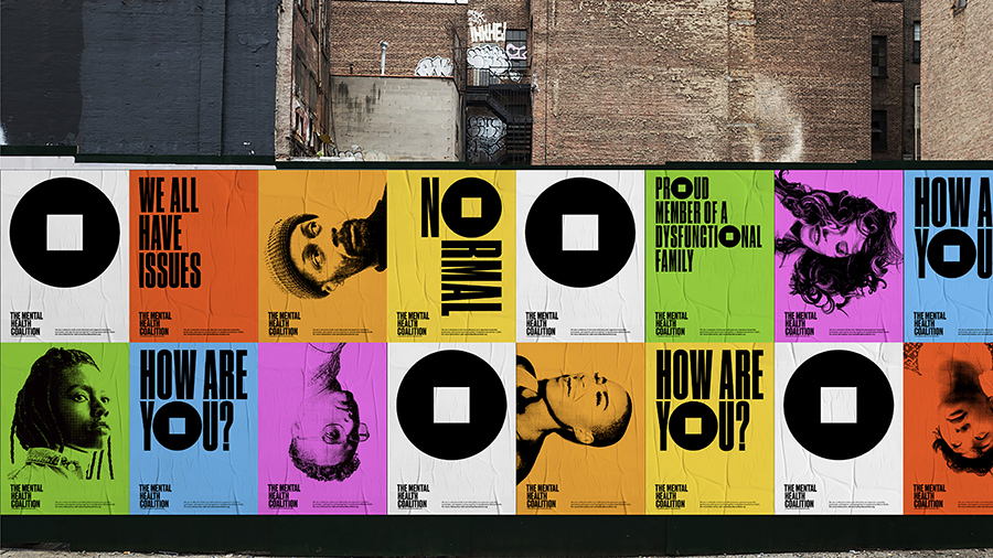
“How Are You, Really?” is a digital storytelling platform designed for the Mental Health Coalition that encourages conversations
SSR: What made you decide to leave that world and start your own firm?
PS: Well, there were a lot of factors, but I was there for a long time and I made about a mile of record covers. I wanted to design things that weren’t square. I wanted to broaden. But mostly, the record industry had been in trouble. In the late ’80s, there was the Carter recession. Reagan had just been elected President in ’82. Carter was ’76. Maybe it was ’80. I’m trying to remember the politics of things. But the politics were changing. The record industry had been gone from being wild and crazy and wealthy to austere. But the worst thing was CDs were coming in, and that meant that my work shrunk, and not only did it shrink, but it went behind plastic. I thought, okay. I really have to make a move.
The problem was I didn’t have any experience doing anything else. So, I took a studio. At that time, I was getting a lot of freelance book jackets because book jacket publishers discovered that record business people did good book jackets because that’s sort of a similar translatable thing. I would get calls from independent recording artists at the same time to do their work. So, I took an office space and by pure coincidence, The Stones came around and they wanted me to do their touring album.
So, I moved into this new space and the first client that came to see me was Mick Jagger and the whole office went wild. I’ll never forget that. That’s sort of strange. I did that for about six months and then I was given a contract by Time magazine to develop a new magazine for them because they thought it would be fun to hire somebody with no magazine experience. They thought, oh, they’d get some interesting take. So, I developed one publication for them and then they gave me another when that didn’t test well, and they decided to develop that publication to launch. I had no magazine experience and I didn’t really know how to launch a magazine. So, a friend of mine named Terry Koppel, who was working with the Boston Globe, he was a friend of mine from college, had moved to New York. So, I asked him to come and work with me because I needed somebody with magazine experience to help me launch this thing. So, we were locked up, literally locked up a top secret room in magazine development in Time Inc. and we got along so well that we started a company.
SSR: Amazing.
PS: He died recently. He died a couple of weeks ago.
SSR: I’m sorry.
PS: But it was a lot of fun, it was really scary, and it was, for a number of years, very successful.
SSR: Yeah. What was the magazine that you launched?
PS: Oh, it was called Together, and it was a magazine about relationships. It was actually a stupid magazine. It didn’t deserve to succeed. I’ll tell you why they were interested in the magazines, because Henry Grunwald was editor in chief of Time Inc. in those days and he liked me, and I had to do a mockup for a cover. They had no cover story, and I took a girlfriend of mine who was very attractive and took a picture of her and put her on the cover and it said, ‘Why hasn’t this woman had a date in 10 years?’ He was so taken with that headline that he wanted to publish that magazine. But in fact, that woman hadn’t had a date in nearly 10 years because she just couldn’t connect with anybody. She’s married now with kids, but at that point in time, she hadn’t. It was the basis for a magazine that didn’t really exist and they didn’t know what to do with it.
SSR: As a magazine editor, what was it that you liked or didn’t like about that whole process of launching a magazine?
PS: Oh, I can’t say that there was something about the process. It was really the way Time Inc., at that period of time, went about magazine launches. They developed and tested and developed and tested and they never could get anything off the ground, where Condé Nast launched Vanity Fair in public at the same time, failing with the first two or three years until they finally had a success. So, instead of dickering around in private and testing, they made something and worked it until it became successful. It just seemed that the timing method may appeared to be more scientific, but it didn’t seem like you could actually come out with something new and automatically gain readership. You would have to develop it. It would have to grow.
SSR: What else did you two work on before you went over to Pentagram?
PS: Well, Terry and I were in business together for seven years. So, we did lots of different things together. We essentially did not collaborate all that much. We had two basic books of business. Editorial design, which was his book of business, and promotional advertising and covers and some identity, which were my book of business. When we first started the business, we got large very quickly because the former president of CBS, a man named Bruce Lundvall, went to Capitol and started Manhattan Records, and also Blue Note. So, Blue Note was started, but he picked up and reemerged the label. So, we did work for both. We had that contract for the first two years we were in business and all of a sudden, we had 17 employees.
It was big and then it shrunk very fast when the account went away. So, they cut down on Blue Note and then we kept Manhattan for a while and then that sort of tanked and got merged into Capitol and then came back. It’s still around. It’s sort of amazing how these things go up and down. The work I got after the record industry was youth related things like Swatch Watch when they first came to the United States, or this candy store I did called Oola that was Swedish that was in the shopping malls for a period of time. Things like that. In the late ’80s, I guess around 1989, it was the first Bush recession.
There was a giant recession before Clinton was elected and our business was decimated. Terry lost every magazine because magazines in recessions do terribly. He really didn’t have any billing for, I don’t know, maybe, good half a year. We just renovated a space and fixed it up, and so we were cash poor going into the recession. He took a job and I ended up running the business on my own. I had this big space and I was renting some space out to other people. During that period, Woody Pirtle and Kit Hinrichs from Pentagram came over and asked me what I was doing doing and if I would want to join, and that’s when they invited me.
SSR: What was it about Pentagram that you liked that made you want to go work for them, or with them?
PS: Well, I liked that the designers there seemed to earn a living while I was actually having the distinct difficulty at it. No. I have to tell you about that year and a half on my own. It was debilitating. When I started the business, I was in my early 30s. When Terry and I were working at Time, I was about, I don’t know, 31, and by the time we started Koppel & Scher, which was the name of the business, I think I was 33 or 34. I don’t really remember quite the age range. I was still getting youth-oriented work, and the problem was that as the decade wore on in the ’80s, I started competing with people younger and younger than me who were entering the field.
I found that particularly after Terry left and I was a woman alone in business that I was getting the same work I had already gotten and the kind of work I was getting was not going up higher in fees. It was more or less the same and I had the distinct feeling that if I didn’t make a definite change, it would go down. So, when the offer came to join this group of men, and they were, they were a big group of men, I thought I’d make more money. Also, their work was good. It was very high level. Pentagram had an amazing international reputation. Michael Bierut, who was already a friend of mine, was asked to join at the same time and he joined six months earlier than me because I had to close down my business. But that also made it easier knowing I was going to have a friend walking in the door.
SSR: As you mentioned, you were the only partner that was a woman. How did that influence you as a leader and did you face a lot of challenges in that role?
PS: Yep. You have to realize that the partnership in the New York office wasn’t so terrible. It was five guys. The London guys were 15. I guess there were 10. There were 15 men altogether when I went to my first partners dinner. The first partners meeting I went to was in Rome, and we were staying at the American Academy in Rome. I remember we all went out to dinner and there were 15 men and me, and they had a big table that was in a circle and I had my little seat. One of the help, either the hostess or somebody who was guiding us to the seats said to Alan Fletcher and two other men who she was talking to, she said, ‘Why is there only one woman here?’ Alan Fletcher said, ‘Oh, she was the only one who was talented enough to join our group.’ She looked at me very snidely and said, ‘Oh, you must be very, very talented.’ I remember feeling like, oh, God. It’s bad any way I look at it. This thing is completely wrong.
There were other moments and they all seemed to have to do with these circular situations where I remember there was one dinner where I got up at the partners meeting and went to sit outside, and I sat outside and one of the partners came and sat with me, and there were two of us sitting in chairs. There was a whole pile of chairs next to the building and we were sitting in a park-like area. Then a third person came out and pulled up a chair and then a fourth person, a fifth person. They kept coming out and pulling up chairs. It was sort of fine because it was nice out.
Then I got up to go to the ladies’ room and I came back and I saw the circle of 15 men sitting around with one chair empty and I thought, I don’t want to go over there and sit down. I just went upstairs and went to sleep. There were these moments of it where it was just too much to handle. But one on one, it was never bad. I had my own relationships with people I was closer to and people I wasn’t closer to, and that’s still the truth today.
SSR: Yeah. How do you elevate women today in the graphic design industry? Has that become something you either have pushed for or inadvertently pushed for?
PS: I think both. For a long time, I was an example, and in very insulting way. You’d get a call saying, and this goes back to even the late ’70s, where somebody would call me up and say, ‘We’d like you to speak at the AIGA Oshkosh lecture thing, and it’s really hard to get women speakers.’ So, you were invited and insulted at the same time. There was a lot of that that went on for years. I was always teaching, so I had so many women students that have become successful. Not that they were given more attention than the men students or that there was any even thought about it. It was more that they could see me as an example. So, that made it possible for them to do it. That’s how.
I have three women partners in the New York office and two women partners in the London office. So, there’s six women now, and one of the partners, Natasha Jen, used to be my intern, and that makes me very proud that she did that. Another one, Emily Overman, who had her own practice, was a very close girlfriend before she joined. So, you can help as much as is warranted, that it isn’t, that it’s something I’m going to do every day and get up and say, “Okay, I’m going to make it easier for women.” But by virtue of the fact that you exist, you do that.
SSR: Yep. Very, very true. I feel like you’d be an amazing teacher. Do you love teaching?
PS: Yeah. I do. I’ve been teaching for years. I’ve been teaching in total for 37 years. This year, because of being shocked by Black Lives Matter, I started a scholarship program at CCNY and teaching the senior portfolio course I taught for 37 years at the School of Visual Arts and never realizing they never had a scholarship program. So, I had four Black students in 37 years. That’s depressing. Of course, they’re famous. Gail Anderson and Bobby Martin were two of them. They’re the most well-known practitioners in that capacity. But I’ve had four in 37 years? That’s pretty grim.
SSR: So, how’s the scholarship program? Is it new?
PS: We’re starting it this fall. Emily, Natasha, and I are teaching it together. So, we’re doing it. We’re going to be selecting the students this summer and starting it at Pentagram. I taught my SBA class at Pentagram. I used to teach on Monday nights. So, I think I’ll do the same thing.
SSR: That’s great. How many students are you hoping for?
PS: Well, we want to take 30, 10 per class. The hope is that the skills are there, and they can either become interns of Pentagram of be mentored to work at other good places and build careers.
SSR: You’re also a prolific artist. Your work has been in MoMA, Cooper Hewitt, Victoria and Albert, which is beyond amazing. How does your artistry inform your work at Pentagram or how has this been an outlet for you?
PS: I started painting in the year I was working on the Citibank logo, that I had designed this corporate logo and I had to proof it a million times and design all these little iterations of things that one does when you do that kind of corporate identity. I felt like at that period of time, I wasn’t really creating anything or working with my hands very much like I used to. Before I started painting the maps large, I used to paint satirical small maps. As a matter of fact, the Pérez Museum in Florida, the collectors there, the Sackner family, had collected one of my small painted maps and they use it to promote the museum, as well as the fact that it’s in the museum, and they gave me my start.
After they purchased it, I thought, I really should do something with this. So, I was up in the country on weekends and seeing where my husband was very prolific artist and I wasn’t doing much of anything and I thought, I bet this map would look great big, and I started painting these things bigger and they got bigger and bigger. In the process of doing it, I found these visual languages. I had a friend who came up and saw them and showed them to his gallery. He was an artist, and he showed them to his gallery and they gave me a show. So, I began exhibiting them. Then we began making prints from them and now I have a painting gallery and a print gallery and some collectors and it’s a real practice.
My view is that I’m me, but the professions had different rules so that I conduct my business as a designer like a designer and I conduct my business as a painter like a painter, and that the difference is that as a designer, you are in a social position where you are working collaboratively with clients and the clients are hiring you for a specific fee to do a specific thing that you are going to influence and impact, that they’re hiring you as a consultant because of your expertise in the area, and that you’re going to fulfill your obligations to that fee and you’re going to, through that collaboration, deliver them the work that is supposed to be delivered, and that there is nothing that says anything about quality in that condition. So, the work can be really, really tremendous or it can be really terrible. But it’s really up to you to try to decide what your ethic is in doing that. As a painter, you can paint whatever you want and you can do whatever you want. But you could find a gallery if you’re lucky and give it to them and maybe they’ll hang it up and maybe they won’t. Different businesses.
SSR: You’ve done so many different projects throughout your career, but also at Pentagram. Is there one that you can pinpoint as something you’ve learned the most from or was the most challenging project and why?
PS: There are different pivotal projects and they’re things that I did differently in each thing. Firstly, I have to talk about The Public Theater because it’s a 27 year relationship and really, really unusual in our profession. I wrote a book about it that came out in the middle of the pandemic, so no one saw it.
SSR: What’s the book called?
PS: It’s called 25 Years at The Public: A Love Story, and it was a gift book in The Times and The Wall Street Journal. So, some people bought it. But no one was around to see it in a bookstore. The book is like a visual document of the things I made over 25 years. But the narrative is about trying to learn how to do an identity. By that, it’s about how the theater was run and how graphic design has to support that in a very specific way.
I designed a system by which they’d be recognizable because all these ads had a very similar look and similar book of typefaces, which is classic in identity design. Then when I went to design the posters for the individual plays, the posters would change based on the play, but there was some kind of visual language that connected them. I did this for a couple of years and then a play called Bring in ‘da Noise, Bring in ‘da Funk opened on Broadway and I did a number of posters for them using the style of The Public Theater, but in this very street art sort of way with very big loud expressions typography.
The show opened at The Public Theater, so there was a big Public logo on it when it opened The Public Theater, and that’s actually the most famous poster is the yellow poster with all the crazy type and Savion Glover in the middle. Then it went to Broadway and there was a poster that Richard Avedon shot Savion Glover and it had typography over it with a white background, and that was hanging up on Broadway. Then there was a street graphic that was painted on the sidewalk and then there was a water tower and then there were pile of billboards. The promotions for that show went on for, I think, from the time it opened in The Public until about 2000, 2001, until it closed.
So, there was this moment in time where these graphics were everywhere, and people started imitating them. When the show went to Broadway, nobody knew it was The Public because The Public wasn’t on it anymore. It said at The Ambassador Theatre, which was the theater that picked up the play. So, something happened to my work that never happened before was that the ownership of the poster was obliterated by it becoming a style. It’s really bad if you develop an identity for somebody and their identity becomes a style of a city or just a lot of designers. It begins to lose any recognizability as that place. So, in the middle of doing these series of posters for them, I had to stop and reconsider what I was doing.
So, I started designing posters that looked nothing like that and I did a couple years of that where the type was serif typography and very quiet and more remote. But they were very undistinguished as posters. But then I began to realize that The Public Theater couldn’t really gain any traction by the way I had been working with them. Not that I did anything that they didn’t advocate. The expectation was that there would be season sort of announcements and there would be posters for individual plays. But unless you went to The Public Theater and saw the poster, you wouldn’t see the poster because there was limited advertising for it. It didn’t exist on the street like Bring in ‘da Noise, Bring in ‘da Funk, and that the only way you would know about was already being loyal to the theater or being somebody in graphic design who looked in design annuals and saw the things win awards.
But that winning awards has nothing to do with how the public receives anything, and you know that’s true in every form of design, whether it’s architecture, interior design, anything. The awards of the thing of whatever a certain publication or organization determined, but that has nothing to do with public perception. So, I realized I was not really doing the job I thought I should be doing for The Public Theater and it took me about 15 or 16 years to really understand that and then to correct it, and I did and it worked and I feel great about it. It’s also a better job, because what I did, what I was doing wrong was they’re not Broadway. They’re a place. They’re a place that has membership. They have a million programs. The programs were all looking slightly different, not the same enough. The posters were all slightly different, not the same enough, and not enough to recognize them as one thing. So, I began doing this design in seasons. So, a whole season of The Public Theater will look alike and you’ll recognize it as one thing, even though there are many different sub-components to that season. Then at the end of the year, I’ll change it and do the next season. What happened as a result of it is the membership went up.
But I didn’t do my job right for 15 or 17 years, if you think about it. But the point of the book was really about that journey and what it was to discover that and not totally understanding what was going wrong with it. Yet, I know for a fact that most designers don’t do that kind of inquiry and they’ll say, ‘Oh, well, this thing’s going to last for years.’ No, they don’t know that. You don’t know. You don’t know what the future is. For example, I began designing the posters as posters, thinking they’re the most important thing. Nobody’ll see them now. They’re technology. They exist on Instagram. How do you know that 20 years ago? How do you know what you’re making is really viable in that way based on the way the culture changes and the technology changes so quickly, and the way cities change? There’s no way to know is the point.
SSR: I love that you wrote the book about that exploration, that it wasn’t perfect. Most books, not most, but a lot of the books in design are about successes and this is a success, but how you got there is the really interesting part of that story.
PS: I made a decision at one point. The Public Theater’s had its financial highs and lows and I made a decision to essentially take it on as pro bono because I felt I could do better work for them that way. If you work for a not for profit organization and they pay you a certain amount of money, the expectation is a different relationship. The relationship happened by accident because there was a period where they really hit the skids in a couple of years, but then came back and offered me to pay me and I just turned it down because I didn’t want to change the relationship, and that it’s my R&D. My partner, Alan Fletcher, the same guy who did the thing at the restaurant, once said in a partners meeting that most organizations spend 25 percent of their profit on research and development. Graphic designers don’t. So, that’s how you do it.
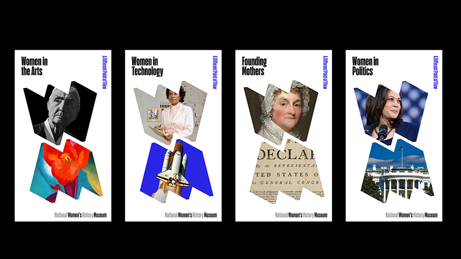
The branding for the National Women’s History Museum in Alexandria, Virginia features a folded “W” symbol
SSR: Yep. Amazing. So, you said pivotal projects. Was there another one besides this that you wanted to mention?
PS: Well, I think there are a series of them that came out of The Public by accident, which were environmental graphics when I began becoming an environmental graphic designer. I was 50. I was old in my career when I began doing that, and it was accidental. I worked on The Public Theater in lobby with Jim Polshek and I didn’t know how to read an architect plan when I did that. I didn’t have to do anything. He just started having me hang stuff up. I remember going to somebody on Michael Bierut’s team and saying, ‘I have to put a banner in this arch. How do I do that?’ She said, ‘You measure the arch, you make a drawing of the thing in the shape of the arch, and then you go to the manufacturer that makes the banner, and you tell them what color you want it.’ I said, ‘That’s it?’ She said, ‘Yep.’
So, that was the first thing I did. The next thing I did was a Photoshop rendering. This was my second big discovery. I had to do a design for the New Jersey Performing Arts Center. They wanted me to transform the building, and I thought I was going to transform it with banners. But it was still a crappy looking building with a bunch of banners on it. So, I painted the entire building. This is where I made a major breakthrough discovery as an environmental graphic designer. I discovered that if you have a picture of a building and you make a Photoshop rendering that looks exactly like the way you want it to look and you show it to your client and you cost it out and they can afford to do it, it will come out exactly like the Photoshop rendering, where if you make a book jacket and they agree to it and you wait six months, you’ll find it looks nothing like what you design because they changed it so many times.
SSR: So, actually, your designs are happening.
PS: No, I love that. I love it. I love that about environmental graphics. Sometimes, you wait four years, but it looks exactly like the Photoshop rendering. I can show you examples. You would be surprised.
SSR: That’s amazing. Was there another environmental graphics project that you leapt off of after that one?
PS: Well, they started getting bigger and fancier. I did a number of theaters. I think Bloomberg’s headquarters was really fantastic because there was the money to experiment with materials and we did these giant letter form out of some kind of Lucite-y plastic, but it was still in the place. If you go into Bloomberg, it’s exactly like we designed it in 2005. It hasn’t changed one iota, and they really keep it beautifully. Then that was exciting because it was big and it had a digital component to it, and I loved working on it. But I also love the Quad Cinema. It’s a very small jewel box on 13th Street where we really did all of the interior design, as well as the graphics, and everything’s made out of quads. Everything is cubed.
SSR: Is there part of the process you love the most? Is it the beginning, is it the end creation? Is the R&D? What is it that you love about the process?
PS: The invention. Phase one. By phase one, I mean, sometimes it’s two, but it really depends on how you wrote the proposal, it’s the phase where you make the schematic drawing of what it’s going to look like, where you invent that, and that the second one that follows, it’s usually good because you’re correcting the imperfections in that. Then after that, I get bored.
SSR: How do you constantly stay inspired and creative? I know this is kind of a big kind of softball question, but where do you find inspiration? How do you keep on top of things and look for new sources of ideas?
PS: Well, I have these talented partners who scare the shit out of me. Their work is so amazingly good and I have to keep up, and that’s what makes Pentagram good, that sort of healthy competition of looking around and seeing what other people are doing and inspiring and intimidating. It’s always good to be a little bit scared.
SSR: Yep. Keeps you going. I know you mentioned doing more environmental graphics. How do you continue to reinvent yourself or evolve? Or is that just the nature of the business or the “luck” of people coming to you for different things?
PS: Projects come in the door and a lot of them are similar to other projects I’ve done before. Then every now and then, I’ll see one with something where I really don’t even know if I’m qualified for the job. Those are usually the best projects because if you kind of don’t know what you’re doing, you’re more likely to make a breakthrough. I feel that if you do something three times, you’re an expert. So, the likelihood, once you become an expert, you’re not going to do very much invention because you’ve already discovered what not to do. The true breakthrough comes in being a little bit ignorant, where you might ask a stupid question that may be an unusual way of seeing something.
SSR: Love that. Tell us one thing that people might not know about you.
PS: I’m short.
SSR: How short is short?
PS: Well, I think I’m shrinking.
SSR: Aren’t we all?
PS: I can’t tell. I have a very different mirror in New York City than I have in the country and the country mirror, I look better in that mirror. I look taller and thinner. In the New York City mirror, I look sort of short and dumpy, and I don’t know how that happened. I don’t remember looking that way in that mirror and I don’t know if it’s that mirror against the other mirror and I just got used to the other mirror. But something is definitely going on.
SSR: I think you need to re-buy the country mirror and bring it to the city.
PS: I have to say, all my clothes still fit. So, nothing really happened. They’re all fitting. They just don’t look as good on me. Or maybe I didn’t know that they didn’t. I don’t know.
SSR: My God, I love it. We always end this pod with a question that’s the title of the podcast. So, what has been or are your greatest lessons learned along the way?
PS: I think that from the beginning for me, I have tried both consciously and unconsciously to defy expectations, and that it started when I was young when I was in a family where I felt like a misfit, and again, at school, and then again in my professional life, and that I’m really comfortable doing that, that I think that you will find yourselves always with some preexisting belief of what you’re supposed to be and that you can defy that.
SSR: Love that so much. Thank you so much, Paula. It’s been such a pleasure. You are amazing and quite a force, so it’s been such a pleasure to sit here and listen to you today. Thank you. Hope to meet you in real life soon.
PS: Great. Thank you.
Summary
Paula Scher’s career is as wide ranging as it is inspirational. The former art student, who pivoted to graphic design, is also a children’s book author; she’s designed album covers for artists like John Prine; she launched her own magazine, Together, with Terry Koppel; and she became the first female partner at New York-based multidisciplinary firm Pentagram, where she’s worked for the last three decades. Among her many clients, her indelible work has transformed the Public Theater in New York, where she learned many lessons over the course of the almost 30 year relationship. Though she has sometimes felt like a misfit, she sees that as another way of rebelling against the belief of what she’s supposed to be. From the beginning, she says, “I have tried to defy expectations.”