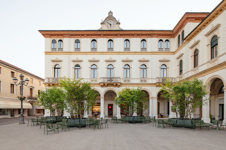
Jonathan Ragusa approached the Del Monte Lodge Renaissance’s Erie Grill as both a hotel restaurant and a local joint. “The restaurant should have its own personality but still relate well to the hotel,” says the lifestyle designer of local firm Arena’s for Life. Set on Rochester, New York’s Erie Canal, the restaurant redesign takes advantage of its views with a fresh setting. “When you’re doing a hotel restaurant, it’s so different because there’s no set demographic in terms of age, client, or group,” he explains. “You cover it all.”
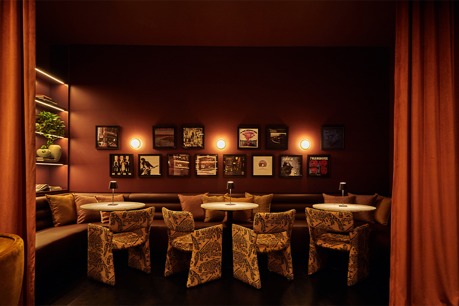
To transition from breakfast and lunch to dinner and nightlife, panels hide the liquor and televisions for the earlier part of the day. “It’s kind of fun because you can play with the bar and transform it,” says Ragusa. “During the day it’s fun to be bright and open and inviting, but at night it’s nice to be a little sexy and a little moody.” Illuminated by LED lights, the handmade glass bar top glows a watery blue.

Showcased behind the liquor displays, a wallpaper print of herring gulls hints at a theme well loved by the Del Monte family. “I wanted to find subtle ways to introduce the herring without it being too garish,” explains Ragusa. “I originally thought, who would use metallic, sparkly, herring wallpaper, and here I am.” The theme is hinted at again with touches like a herring-shaped lamp in the sitting area. “It was so wacky and out of the box that I had to use it and had to love it,” adds Ragusa.

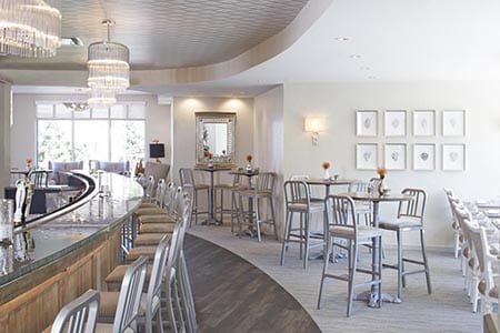
The design also references the nearby canal. Both the carpet and the sheer fabric between the two entrances have a subtle wave pattern “that’s almost waterish,” notes Ragusa. “It’s just a graceful way to suggest these different themes.” By pushing out the space, a long corridor with panoramic windows highlights the view.

Situated against these windows, custom banquettes expand the seating. With a light, neutral color palette in mind, the team searched for durable finishes for the seating that still felt more like high-end, residential materials. For the banquettes, “we found this beautiful vinyl that felt like soft butter leather,” says Ragusa. The chairs from the original space were then stripped down and lacquered in warm gray and upholstered in the same vinyl. “I thought the chair silhouettes were gorgeous, but they were done in a dated finish,” he adds. “When you do them in a solid lacquer, it is more of a contemporary spin on traditional furniture.” Atop French bistro-style bases, the tables were also redone in a dark gray and topped with bleached and stained wood.

“Everything is subtle and soft, and there’s nothing harsh in these tones,” says Ragusa. To balance this palette, he sought art that would be both impactful and refined. “I wanted to find something that would be cool and classic, but I didn’t want people to get stuck looking at art in a weird way,” he continues. “Art is something I struggled with because it can be so controversial.” Eight framed, crystal geodes now give the dining space a neutral, but sparkling touch.

The team also faced the challenge of two entrances and a long, linear space. To help pull the room together, a metallic, diamond-patterned ceiling paper circles the bar and the walkways. “We took the challenges and made them more the pros than the cons,” says Ragusa. “If you’re stuck with something that doesn’t work, you might as well embrace and love it.”