We are a species of color lovers. Our ancestors were outlining their hands and painting geometric shapes and animals in palettes of blood-red, yellow ochre, and sooty black on cave walls some 40,000 years ago. Later, we gave colors meaning. In China, golden yellow was used on everything from roof tiles in the Forbidden City to rich textiles worn at court to signify imperial power. In ancient Greece and Rome, it was a rich reddish-purple that made the wealthiest and most powerful weak at the knees. We have gone to great lengths to secure the best and brightest. The semi-precious stone from which ultramarine blue was made was traded many thousands of miles from what is now northeastern Afghanistan to reach Florentine artists during the Renaissance. That regal purple dye was extracted from crushed Mediterranean mollusks, and it took around 250,000 of them to make just one ounce.

The Reading Room lobby in the Whitby Hotel in New York evokes energy, power, and creativity
Reading Room Lobby, The Whitby Hotel, New York
Even now, when we can drink in a million saturated hues on telephone screens before breakfast, the colors we surround ourselves with telling us potent stories. Take the symphony of reds in the Reading Room lobby at the Whitby Hotel in New York. Given structure by the percussive hits of white and black—picture frames, the rhythmic zigs of the chandelier—they evoke energy, power, and creativity. Raw red like this inspired Mark Rothko, Lee Krasner, Anish Kapoor, and Salvador Dalí. Indeed, the settee’s appliquéd fluttering hearts and trapezoids recall the crimson smack of his surrealist Mae West Lips Sofa. On the walls, the shade is more muted, a softer red of iron-rich earth tones used by indigenous artists in Australia. Spiky, rectangular motifs in soft white, blue, green, and orange heighten the association. These reds encounter each other here and find they have one thing in common: passion.

Sepia tones in the Events Lobby at the Whitby Hotel offer a nostalgic feeling
Events Lobby, The Whitby Hotel
Notwithstanding its bold coral column and Indian miniature-inspired motifs on the walls, the event lobby’s soft blend of varying shades of brown give it a nostalgic air. These are the tones of faded sepia photographs or pen and ink drawings on crumbling paper. During the 18th century, a revival in Rembrandt’s sketches, which had already lost much of their original inky intensity, started an interest in sketching in the Old Master style. This meant using only brown tones. The alluring romance of the old, woody hues often puts people in a contemplative frame of mind. Here, they encourage guests to relax and linger—to draw out a conversation and delve into ideas put aside too long.
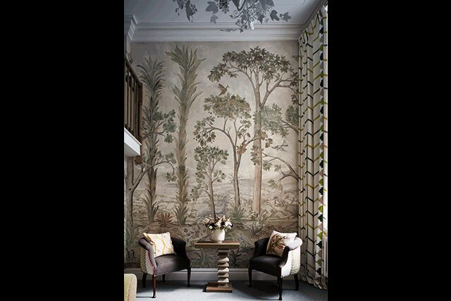
A bouquet of green hues mark the Charlotte Street Hotel Loft suite in London
Charlotte Street Hotel Loft Suite, London
Serenity requires different color combinations. Blue, white, and gray with touches of pink and plenty of texture make this London living room feel airy without becoming too cool or formal. Yet, this Charlotte Street Loft suite uses a bouquet of greens: olive, sage, avocado, fir, and chartreuse. Romantic touches like the ivy light fitting and the floor-to-ceiling mural with its host of mythic creatures are balanced by the strong geometric design on curtains and chair backs, like a trellis in a secret garden. Although it may seem counterintuitive, given how green our world is, they have been among the most difficult and unreliable on artists’ palettes, often fading or turning brown. Artists that had a knack for them, like the 16th-century Italian Paolo Veronese, used their green-fingered charms to make their names and fortunes. Others could only pine: “I wish that we had a green pigment as good as a red or yellow,” lamented one Dutch painter in the 1670s. We have no such excuse. Hundreds of hues are available to us, with more being created all the time. All that is needed is a little time, inspiration, and a story to tell.
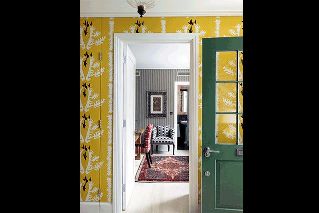
The sunny yellow corridor in a London townhouse, designed by Kit Kemp
London Townhouse by Kit Kemp
During the 1890s, writer and poet Richard Le Gallienne wrote an essay dedicated to his favorite hue. “‘Till one comes to think of it,” he writes, “one hardly realizes how many important and pleasant things in life are yellow.” It’s an energizing and fresh hue, one to clear out sinuses and blow away cobwebs. The shade in this corridor is redolent of egg yolks, fresh butter, sunflowers, and daffodils—that green door is surely the precise green of a daffodil stem—orange juice and, of course, sunshine. It’s a color as unapologetic as the abstract design on the Sirenes fabric from Pierre Frey used to line the walls. (The colorway for this fabric, incidentally, is called Soleil.)
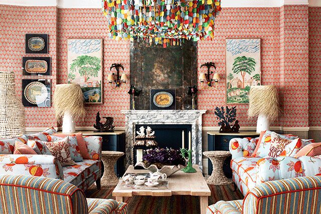
Kemp’s Caribbean Suite pop-up at the Turnell & Gigon showroom in London
The Caribbean Suite Pop-Up at Turnell & Gigon’s Chelsea Harbour showroom, London
If the palette of a sunny rural springtime has butter yellow at its heart, the hues of this living room are the ones you’d use to conjure up market day on the chicest of tropical islands. There’s blue in there (that sky, those seas!) but a host of others, too. Green for rustling palm trees, sandy white, a riot of tongue-tickling red, yellow, and orange. There is hustle and bustle in this palette, but strictly of the kind only found a world away from an urban commute.