AV Nightclub, Los Angeles
A Q&A with Tosh Berman, owner and designer
By Erinn Waldo
What was your design brief for the project?
This was my first nightclub in Hollywood, and I wanted to evoke a combination of 1920s, old Hollywood charm with modern aspects. I wanted to create this over-the-top, boudoir style, sexy scene with an element of femininity, and still create a real show behind the venue.
What was the footprint of the club?
We built it to look big, but at the same time we only had about a 2,700-square-foot footprint inside. We did this by elevating the booths, building different spatial entrances, platforms, and foyers that led to nowhere but at the same time had a specific reason behind them, which all worked to create grand entrances.

How does the space maintain crowd control?
I wanted there to be a cascading effect in the main room where you have the ability to sit in the booths, stand in them, or be on the floor. This gives an even feel to the crowd, and it also allows me to layer in the people I need to create a rolling momentum for a party. I also wanted to establish some safety points in there, so I put in stripper poles—they literally are stripper poles—and created these cool lampshades around them so they had purpose. Nobody’s climbing up on them, but they’re used for people to hold on to and grip while they’re dancing.
What does AV stand for?
AV was the first two letters of my management company, and it was easy to remember. It really didn’t mean audiovisual, but as we continued down the path that the nightclub was going, the audiovisual aspect was at the forefront of what we were trying to do. We had the best sound system that you can have in nightlife, and we went above the norm of what you would find in Los Angeles with those components.
How did you incorporate these digital aspects into AV?
Once I got in there and saw the size of the room and the feel, I realized that doing anything too digital would pull away from the general design. So I designed this custom fit, individually circulated filament bulb. It’s a digitally driven lighting concept, yet the general feeling is analog. I think that it’s an important aspect of the room. If you end up making the design too modern or too space age, it pulls away from the sexy, dark, over-the-top element, which I thought was important for Hollywood.

Tell us about the Marion building, where AV is housed.
The Marion building was built in 1920 as a hotel. Through the years it changed hands a few times, and in the late ’70s it was turned into this seedy, trendy gay bar Spotlight, which was open 24 hours. The cool thing about it was we ended up getting this grandfather license, which is one of the oldest licenses in Los Angeles. With it, we can stay open until 6 a.m.
How did building AV affect the surrounding area?
The building had a lot of interesting heritage, and at the same time it almost became too seedy for the area because of the late-night partying. When Spotlight closed we got a big rally from the community because everyone was looking for something a little cleaner that brought a slightly more sophisticated demographic to the area. We put cool wood rafting outside with vines growing up the exterior, and the building has been refaced and brought back to the old 1920s Marion feel.

What colors and materials did you use for the interiors?

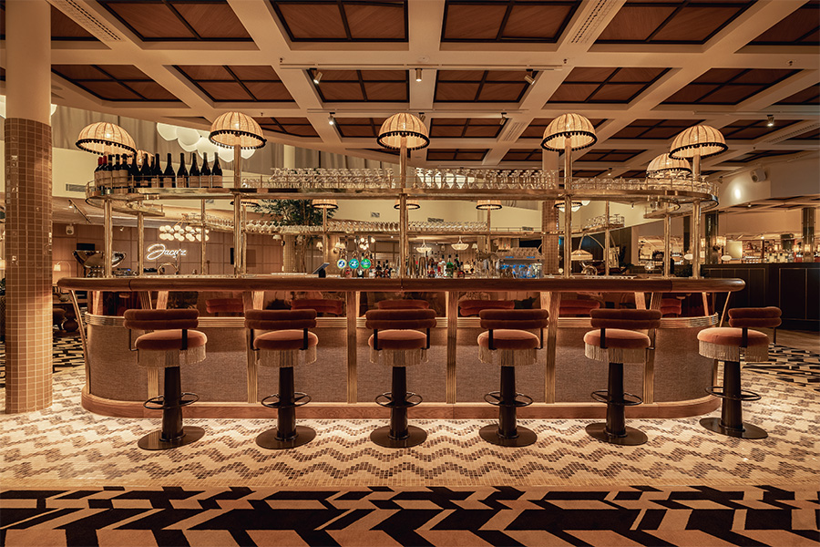
The main color palette is a rich blue, brown, and chrome. Chrome was something I thought would be interesting and different, and something I hadn’t really done before. You would generally find brass or gold in those 1920s bars and nightclubs. We used a lot of cool wood structures, built-in pieces, and backbar pieces using leather. I went with textured leather or hand-tooled leather because I think it helps pull out a little bit of distinction, as opposed to your basic brown leather booths or banquettes. In some of the ones where I did more of the basic brown leather we ended up doing a nice tufting with metallic buttons and old, aged metal nails. We used those to accent the edges of the booths to tie all three components together.
The lighting is colorful and dramatic. Why did you go in this direction?
We have more lighting and sound than some of the bigger venues, and we did that so we can create different types of lighting for different types of parties. We were able to create dramatic changes in the venue with eighteen different moving heads. There are another twelve different spots where we can light up the room and change the general feel even in its complexities.
How do you use the lighting at the bar?
The bar is a full LED back wall so we can change the colors. We usually keep it at a blue or red, depending on the night and depending on my mood. The color I pick will also depend on the way that people feel as well. Red is a little warmer than using blue, and it has a sexier kind of feel, but sometimes I will see a few altercations or issues with a client and I’ll actually use that as a jumping point to change the color. It’s amazing how that actually will affect people’s moods and the way they interact in the club.

What is the bar made of?
To create the backbar, I first painted the whole thing white, and then I put an inlay in the middle—an aged mirror. It’s like a patina, but it’s actually an antique mirror that has natural age. Around it, I put in the LEDs so we could get a nice reflection off of it. On top of the LEDs we put a layer of Lexicon glass. It’s not frosted, but it has a rippling effect. The idea is that you can’t see through it. It kind of has a clean, yet fogged over look so you can’t really see the lights.
What about the metallic designs on top?
Over the top of the glass I laser cut sheet metal into the design that you see there. Basically, I had them make tiles and we individually placed them in. The tiles can be taken out and put back in.
Can you explain the wall décor and the use of portraits?
I’ve never been a fan of having TVs in any bars; I don’t like the look and feel. There’s something to be said about creating theatrical components that catch people’s eyes but can also interact with them on a nightly basis. When you have these clients who come in and spend an enormous amount of money, you want to create situations where you can showcase the venue and showcase the client. So the portraits are actually LED screens that we flipped vertically and placed in wood frames. I had a company do an incredible interactive system with moving artwork and 17th-century baroque-style artwork. All of the sudden, the head in the portrait will move, the eyes will move, and then it slowly transforms into an entirely different piece.

What were you trying to achieve with the wall design?
Originally we had it structured so that inlaid wallpaper was in between. When we got closer and closer to the date, I realized I felt like I’ve seen that done everywhere else. I wanted to create more layers at the same time but not break the bank. What I ended up doing is finding flocked wallpaper and pounding out plywood with wood hammers to create an aged effect to them. Then we plasma cut the wood for the design and layered those on top of the wallpaper.
Can you describe the wood?
Originally those pieces were silver, but before opening I ended up changing them to a metallic oak color. Silver ended up giving it too much of a damask feel. AV has a baroque style, but silver has a Persian feel and it didn’t exactly fit. Now it has a different shade of brown, catches the light a little bit more, and it’s subdued. It has an amazing contrast—there’s a wood frame on the outside, and you have these whimsical baroque-style pieces laid on top of the wallpaper. When the light passes by, it pops out at you. It almost gives it that new element that maybe you didn’t see before.
What were your challenges?
I wanted to create a space that’s timeless. With every venue I do, I get more and more involved thinking of things that probably don’t matter to the consumer. I’m sure if you walked in there at night, there are 50 things in there that you wouldn’t have noticed that I see on a regular basis. At the same time, I wanted a feeling that wasn’t going to evoke too much modernism, but was going to feel clean and new. I think that was one of my biggest challenges—to create that classic look and at the same time keep it clean and modern in a way that fit the direction and style of this type of nightclub. We use these incredible moving screens and an incredible sound and lighting board, but not making it too ‘Tokyo disco’ was my main challenge. As we got close to the finish line, I think it got easier because it doesn’t come across this way at all.

What’s your favorite part?
All the custom wood components. There’s nothing cookie cutter when it comes to the wood that we did, and everything was just really well done, even down to the way we did the supports for the bar. I love when other designers and peers in the industry come in and they look at the construction and see the craftsmanship. I love that about the space. Ultimately, that’s what I love about this business: the creating aspect more than anything. For me, the part that I enjoy is the floor plans and the design and figuring out the elevations. Everything has to be deliberate. Everything has to be thought through spatially. Nightclubs are not about windows or exposure to the outside; it’s about continuing what’s happening on the inside in this one moving piece.


