As the consumer cannabis landscape evolves across North America, so do its temples. Inviting retail spaces and lounges reinterpret a residential sensibility to create a more approachable marketplace, where equity is more vital than ever.
Newcomers like Rose Mary Jane, a forthcoming cannabis retail and consumption experience in Oakland, California, will serve as a hub dedicated to promoting Black, brown, and female ownership. Designed by Chicago firm Curioso, the store, lounge, and garden will reinforce the brand’s connection to the natural environment. “We see cannabis expanding nightlife culture in a different way,” says firm partner and cofounder Nina Grondin. “It straddles that recreation and wellness space. There is this evolution of getting away from binge drinking and staying out late and fusing a little bit of care and wellness into our drinking culture.”

Rose Mary Jane, shown in a rendering, will comprise a boutique, lounge, and a garden
Indeed, the marijuana business is expected to add nearly $100 billion to the U.S. economy in 2022, rising to $155 billion by 2026, according to analysis from MJBiz Factbook. (MJBiz is a Hospitality Design sister company.) Here, we look at four concepts that set a new, design-forward standard for a more inclusive industry.
Green Qween, Los Angeles
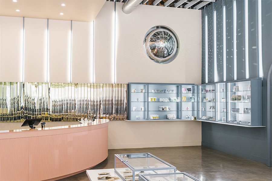
A disco ball embedded into the back wall adds a sense of glamour to Green Qween
Green Qween makes a splash in Downtown LA, reanimating a 1930s Art Deco structure into a vibrant but sophisticated space dedicated to LGBTQ+ and BIPOC-owned cannabis brands. Described as “colorful, whimsical, fluid, and playful,” the retail location channels a spa day in the Emerald City with dimensional geometry and iridescent finishes accentuated by natural light and a grandiose disco ball embedded into a back wall. “[Green Qween founders Andrés Rigal and Taylor Bazley] wanted to achieve the perfect balance between a tasteful celebration of the building’s aesthetic heritage, the required functionality of a cannabis retail operation, and the elevated aesthetics of the local community that represents DTLA,” says Randy Simmen, head of design for Woodbridge, Ontario-based SevenPoint Interiors. “From the disco ball to the budtenders’ aprons that match the color palette, the design evokes a sense of welcoming and brightness unlike any other retail dispensary in Los Angeles.”
Green Qween is wrapped in a soothing palette of blue and apricot tones
Refreshing blue and apricot hues juxtapose display cases shaped by metal tubing and clean white detailing. Each element is set against a retro-futuristic backdrop that nods to the brand’s queer roots. “We focused on playful color blocking and large-scale repetition of arches and fixtures to create an elevated shop-in-shop experience,” adds Sevenpoint creative director Desmond Chan. “Although rainbows are not covering any surface of the dispensary, dichroic accents paint the space in a prism of light throughout the day.”
Bud’s Goods & Provisions, Watertown, Massachusetts
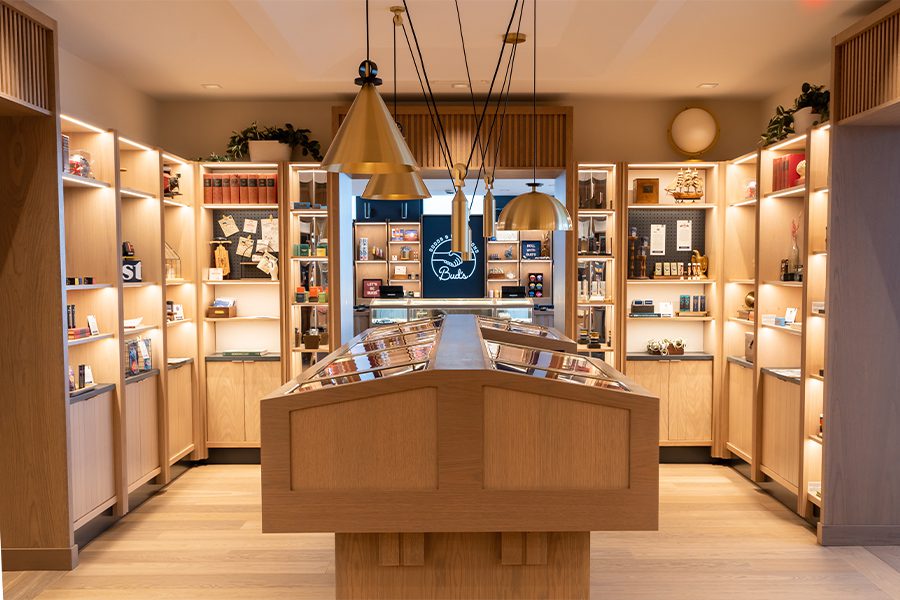
Geometric light fixtures descend from a cavernous ceiling to illuminate a flower bud table in Bud’s Goods & Provisions library
Housed across the ground floor of a multi-family residential structure in Watertown, Massachusetts, Bud’s Goods & Provisions is defined by accessibility. The space is conceived by New York firm Brand Bureau (an AvroKO Company) with an emphasis on education to destigmatize the cannabis landscape and present the storefront—and the residences—as invitingly as possible. “New England original” was a guiding framework for the project, which reimagines the area’s colonial homes through materials such as reflective mirrors, lime paint, soapstone, stained wood, and rhythmic slats.
“With cannabis in particular, it’s a delicate balance of allowing the guest to feel safe with references of familiarity while also presenting opportunities of uniqueness,” says Hilary Miners, head of environment design for Brand Bureau. “It brings an unexpected—and elevated—aesthetic to the cannabis typology.”
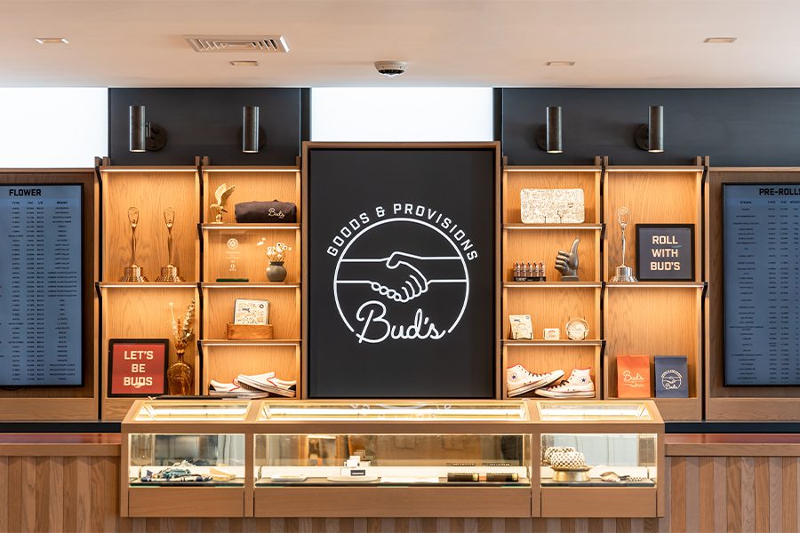
Shelving at Bud’s Goods & Provisions showcases curios and places the company’s branding front and center
Lined with white oak wood and charcoal soapstone, the pantry recalls a New England kitchen, complete with millwork and even a custom wood table stained the color of denim. The library is oriented around a flower bud table, echoing the materiality of the neighboring pantry while distinguishing itself with a cavernous ceiling outfitted with milled oak and an open slab that suspends geometric brass pendants. The check-out area, set against a backdrop of stained glass, nods to surrounding industrial buildings. “Bringing this domestic reference point to both the design language and the experience allows the guest to feel a sense of comfort in a territory that is incredibly foreign and pioneering,” Miners says. “This juxtaposition of the recognizable with the unknown—through the lens of modernized residential craft—is what makes Bud’s stand out.”
The Artist Tree Lounge, Los Angeles
For LA’s Artist Tree Lounge, a residential sensibility is achieved via floor-to-ceiling bookshelves and outdoor spaces
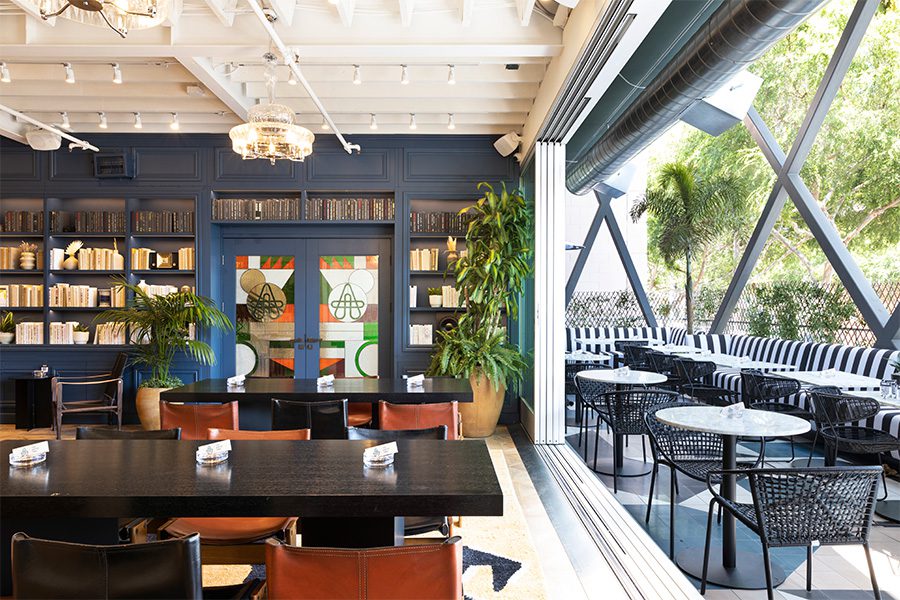
The only cannabis consumption space in Los Angeles, the Artist Tree Lounge houses far more than retail. From a ground-floor boutique to a rec room hosting programs like yoga or comedy classes, the outpost is equipped to put visitors at ease. “We drew design inspiration from some of the original coffee shop concepts of Amsterdam,” says Kevin Klein of his LA- and South Florida-based namesake firm. “The European coffee shops have always had an intrinsic hominess and comfort to them that made you feel as if you might be in a close friend’s house.”
Custom stained glass doors with the Artist Tree logo welcome guests to the refined setting, reminiscent of a European flat. Operable walls are installed at the front of the lounge, linking it with an external patio lined with banquettes atop multicolored cement tiling. “We thought it was important that when you formally enter the lounge, you are interacting with something imaginative and whimsical,” Klein adds. Large-format parquet floors span the lounge along with expansive floor-to-ceiling bookcases populated with literature, accessories, and other goods. Communal tables are paired with modern seating that promises maximum comfort for guests.
Styled akin to a sushi bar, the midcentury-inspired bar in the rear of the lounge makes a sleek statement as guests dabble in edibles, waxes, THC- or CBD-infused cocktails, or even gravity bong hits. “There simply isn’t another place in the city where you can simultaneously be served a joint, a cold brew, and a burger,” Klein says. “The design is unique because the concept is literally one of one.”
Superette – The Annex, Toronto
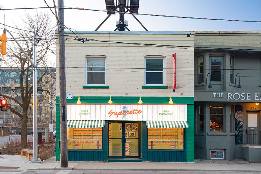
From Superette, the Annex in Toronto references old-school Italian delis
Touting a portfolio of nostalgic designs that reimagine the dispensary as a supermarket caricature, Superette has added its seventh location, known as the Annex, in Toronto. The latest iteration mirrors an Italian deli, complete with green and white checkered floors, faux autographed black and white photos of celebrities devouring pasta, and deli cases displaying cannabis merchandise. “When creating Annex, the conversation focused on how we can take ideas and concepts that have worked for us in the past but build out a new themed experience,” says Superette visual designer and merchandising manager Allyson Young. “We don’t use menus in this shop. We want our customers to shop with their eyes.”
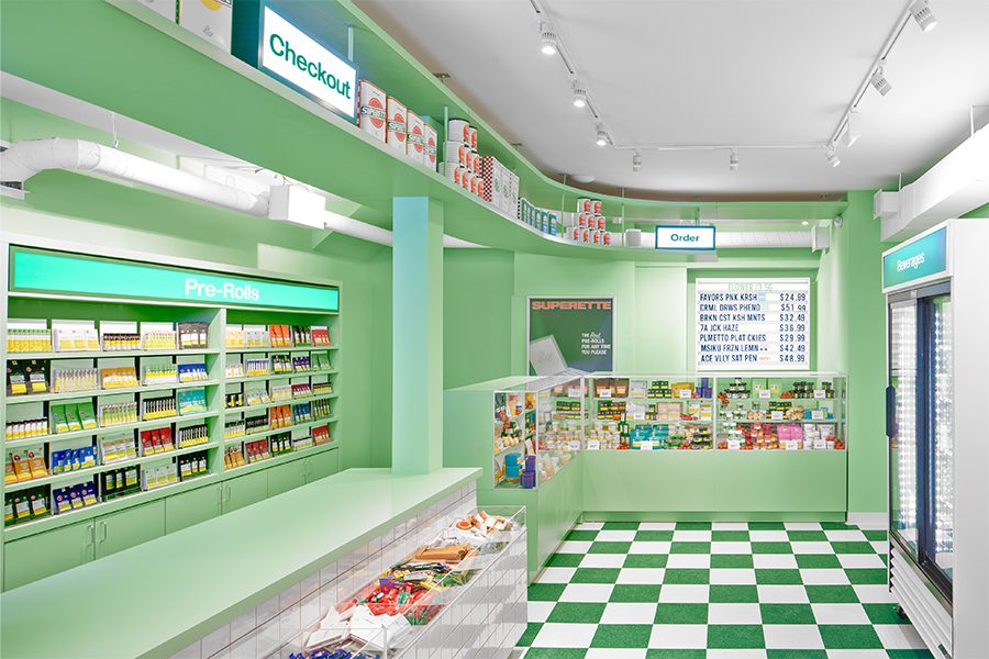
The Annex is characterized by checkered floors and pistachio hues
An oil drum is upcycled and wrapped in vinyl to serve as the host stand, echoing the Superette-branded tomato cans lining the shelves and hanging over the Bud Bar. In lieu of signage, a wall of pre-rolled joints and a beverage fridge also animate the colorful 500-square-foot interior, while accessories like pipes adopt food forms, from eggplants to ice cream cones. Seating is also installed at the front of the store beneath large red pendulum light fixtures that contrast the pistachio hues of the walls and floors. The motif even expands into a partnership with local Jewish deli Rose & Sons, which can be reached by Annex customers via a red telephone connected exclusively to the neighborhood institution. “Every Superette shop follows the same aesthetic in being a fun, nostalgic, and stigma-free environment,” Young says. “We want our shops to feel familiar to customers by making them into inviting spaces.”
This article originally appeared in HD’s October 2022 issue.