
“We wanted guests to feel euphoric,” says Paolo Ferrari of his namesake firm’s design for Toronto cannabis dispensary Alchemy. Taking that idea one step further, the goal for Ferrari and company founder and CEO Richard Browne was to eschew cliché “to create a compelling and distinctive in-store experience, elevating the cannabis experience for the aficionado, but also serving as an exciting entry point for customers rediscovering or new to cannabis,” says Ferrari.
The locally based designer played with contrasts throughout the 1,500-square-foot space, energizing the all-white palette with moments of color and texture, like yellow display shelves, a ceiling made of anodized aluminum fins, and digital cannabis artwork by Tristan C-M.
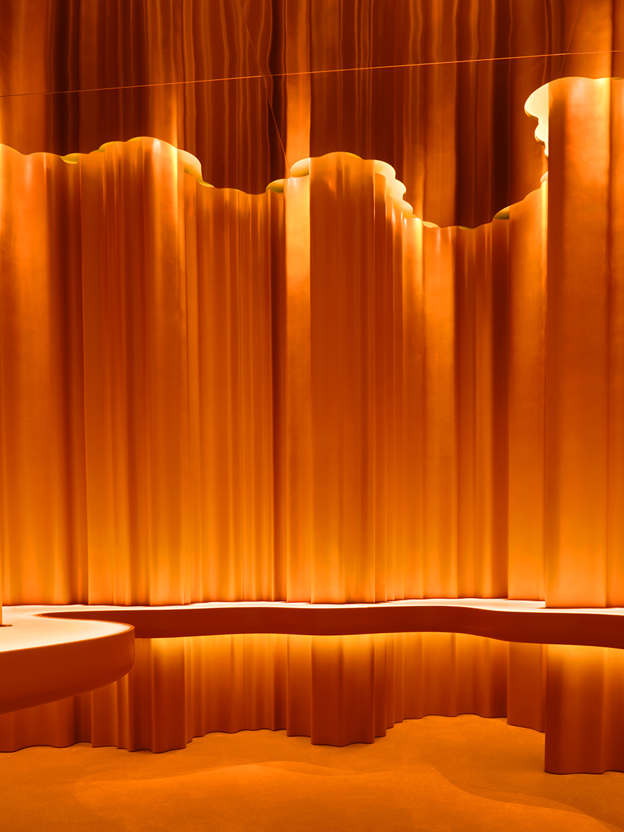
The accessories room is a dramatic play on color-blocking thanks to an undulating feature wall wrapped in a bright orange eco-resin and a carpet done in the same vibrant hue
Both reverential and functional, the soothing atmosphere is inspired by the dichotomy inherent in cannabis. “You have a very humble natural product that has been bioengineered to enhance its attributes. We wanted the design to express this incredible tension,” Ferrari adds. For instance, digital viewers that animate the surrounding walls with kaleidoscope imagery are set against raw aluminum, ash wood, and unglazed terracotta tiles that cover desks, columns, and walls.
Fabricated from solid brushed aluminum and powdercoated steel, shelving fixtures double as sculptural partitions crafted to appear weightless. Sniff jars containing product are displayed across a handcarved solid ash table embedded with digital screens that provide details about the different strains. “There is something beautiful about the precision of highly engineered materials in close proximity to materials that are crafted by hand and recall the Earth,” Ferrari points out.

The experiential accessories room also makes a statement with an immersive color-blocked design: An undulating feature wall is wrapped in a bright orange eco-resin with carpeted floors done in the same vibrant tone. Color, Ferrari says, was used to reflect the concept of transformation—the hallmark of the brand—while also contrasting the natural material palette to create a sumptuous and profound design story. “There is a level of freedom in designing for a cannabis customer,” he says. “We were able to pursue a less prescriptive retail approach.”


This article originally appeared in HD’s April 2021 issue.
More from HD:
IRTH Landscape Hotel and Spa Showcases Its Surroundings
10 Pink Spaces That Pack a Powerful Punch
Biophilic Design Enhances Two Healthcare Facilities